Treemap Charts for Visualising Differences Between Things
Hello reader, today I want to bring to your attention the treemap chart. I came across this chart late in my software engineering career and when I did I wished that I knew about it earlier. The treemap chart is a compact way of presenting data in such a way that makes comparisons between different data points quick and easy.
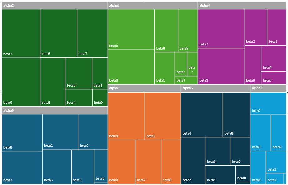
A sample of the data used to create the chart above is below:
| Alpha | Beta | Gamma |
|---|---|---|
| alpha0 | beta0 | 4157 |
| alpha0 | beta2 | 6652 |
| alpha0 | beta3 | 7018 |
| alpha0 | beta4 | 127 |
| alpha0 | beta5 | 5232 |
| ... etc ... | ||
I like the treemap chart for the following reasons:
- You can see at a glance the relative differences between the metrics measured.
In the chart above you can see that alpha2 is largest and alpha3 is the smallest.
You can also see relationships such as beta2 and beta0 are larger on alpha2 compared to alpha8.
- I didn’t put a name to the metrics because you can represent a lot of different metrics with the treemap. For example the chart above could represent the number of requests per customer across all servers or it could represent the number of database transactions per customer across all services on a single server. It really just depends on what you want to visualise!
- With a two level graph as shown above, you can view the relative distribution of items. For example
in the chart above alpha2 has 9 beta entries while alpha1 has only 5. The difference is visually
apparent and removes the need to explicitly count.
- This is useful if you need to figure out if something is over or under provisioned compared to everything else e.g. if one server is handling more customers than another server.
As a side note, the chart above was created in Microsoft Excel - this is the only application I’ve found so far that can handle two levels of data. Google sheets also has a treemap chart but it can only graph one level of data. That said, the chart could easily be created manually by drawing a bunch of boxes with the right relative size.
I wish I knew about the treemap chart early on in my software career as it would have made communicating information so much easier. Specifically, when used as part of a real-time monitoring system, it is an easy visual way to compare things at a glance. I will definitely be including treemap charts on any monitoring dashboards that I need to maintain from here on out and if you also agree that the treemap is a great way of representing information that needs to be compared then I hope that you will also make use of it next time you need to visualise something.